Can the SDGs be achieved by 2030?

Global Development

In 2015, world leaders agreed to the Sustainable Development Goals (SDGs) that will replace the Millennium Development Goals(MDGs) and shape the next 15 years of international development. The goals are very ambitious, aiming to end poverty, improve human rights and achieve environmental sustainability (among other things) by 2030. As readers of this blog will be well aware, the SDGs are perhaps best known for their complexity, encompassing17 goals and 169 targets. To date, discussion has largely been divided between those in support of the broad,aspirational nature of the goals, and those who think the lack of prioritisation has led to a rambling agenda that hasleft no target behind. Nevertheless, this week the SDGs will be agreed to, which brings a number of questions to the fore: how much change is required to achieve the ambitious SDG agenda by 2030? Which goals are most off-track and will need to be prioritised? And what are the particular challenges that will face different regions?

The-Global-Goals-2-300x136

Reaching the SDGs by 2030

A new Overseas Development Institute (ODI) flagship report, Projecting progress: reaching the SDGs by 2030, attempts to answer the above questions. Using projections from leading international organisations, including the World Bank, the OECD, and the World Health Organization, the report quantifies how much the world would need to accelerate current trends in order to achieve the SDGs by 2030. To make the task more manageable, only one key target is examined for each of the 17 goals. Goals are ‘graded’, based upon how close they would come to being achieved if the current progress toward the goals were to continue to 2030. An ‘A’ grade implies that current progress is sufficient to meet the target, while ‘B’, ‘C’, ‘D’ and ‘E’ grades represent a continuum of how much faster progress would need to be. An ‘F’ grade indicates that the world is currently heading in the wrong direction – there may actually be a regression in progress toward the goal by 2030. The results of this analysis are shown in the scorecard below.

SDG-Scorecard-2030


Not a single goal will be met by 2030 if current trends continue. There are no A grades. This is not necessarily a bad outcome. The goals are self-consciously ambitious, and are at least partly intended to encourage extra effort beyond current levels.

Three targets received a ‘B’ grade: ending extreme poverty, boosting economic growth in least developed countries (LDCs), and halting deforestation. The ‘B’ grade indicates that if current efforts continue the world will get more than halfway towards achieving the target.

Nine targets received a ‘C’ to ‘E’ grade, indicating that in order to achieve them existing efforts will have to be between two to eight times greater than current trends. These goals include much of the ‘unfinished business’ of the MDGs, such as improving health and education standards across the developing world. In addition, some of the ‘new’ goals fall into this category, such as those relating to peace, partnerships and industrialisation.

Five targets received an ‘F’ grade, as current progress in these areas is heading in the wrong direction. These SDGs require that the existing trajectory turn around – if it does not, the world will be further behind these targets in 2030 than it is today. These include a number of goals related to environmental issues, such as combating climate change and improving waste management, as well as reducing income inequality.

Regional differences

The scorecard is based on global projections. However, the report also highlights that there is likely to be substantial variation both between regions, and between goals within regions. For example:

  • In sub-Saharan Africa, although the proportion of people living in extreme poverty is set to fall by 2030, the absolute number is projected to rise due to population growth. Only two-thirds of children in sub-Saharan Africa are projected to complete secondary education by 2030, while for the rest of the world the proportion is expected to reach 90 per cent.
  • South Asia is on track to see 350 million people escape extreme poverty, yet the region is likely to have a maternal mortality rate almost double the global target.
  • In East Asia and the Pacific, both extreme poverty and maternal mortality are projected to fall substantially, however it is set to continue to have the most unequal economic growth in the world.
  • Latin America and the Caribbean is projected to sustain impressive progress on pro-poor growth, but is likely to continue to suffer a high number of violent deaths – the highest of any region.
  • The OECD is projected to continue to impose the biggest environmental impacts in per person terms. This highlights that even in the richest countries, major shifts are needed in order to achieve the SDGs, particularly in regard to addressing climate change and sustainable waste management.

Where does this leave us?

This analysis should not be interpreted as a predetermined outcome. Instead, it should serve as a wakeup call that if the SDGs represent ‘the future we want’, then a rapid acceleration in current progress is required to achieve these ambitious goals. Simply maintaining the status quo won’t be enough. Radical change is required. The good news is that this has happened before. In fact, many of the SDGs would be within reach by 2030 if the world could replicate the progress of some of the top performing countries over the MDG era. However, change will need to begin immediately and countries must not delay implementing the SDGs at a national level. Each additional day that the current rate of progress is just maintained will make it that much more difficult to achieve the SDGs by 2030.

This blog originally appeared on the Development Policy Centre Blog available here: http://devpolicy.org/can-the-sdgs-be-achieved-by-2030-20150924/
Can developing countries afford the SDGs?

Global Development

2016 marks the beginning of the Sustainable Development Goals (SDGs) and national governments are grappling with how to implement them. Aid donors are also considering how they can best partner with national governments to see the goals achieved by 2030. This raises a number of important and largely unanswered questions, chief among them: how much will the ambitious SDG agenda cost, and can countries afford it?

This post addresses these questions by summarising the findings of a recent Overseas Development Institute (ODI) report that calculates the cost and affordability of achieving three key SDG targets – ending extreme poverty, attaining universal primary health care, and attaining universal secondary school completion by 2030 – on a country by country basis.

How much will the SDGs cost?

In August 2014, an UN Intergovernmental Committee of Experts estimated the total cost of the SDGs to be “trillions of dollars a year”. While this provides an indicative global estimate, it does not directly translate into how much the SDGs will cost in each country or whether they are affordable.

The ODI report sheds light on this by focusing on three key SDG targets that will rely heavily on public expenditure. The report examines developing countries that have populations over one million people and at least one per cent of their populations living in extreme poverty.

The total cost for the SDG targets related to poverty, health and education is estimated to be US$148 billion a year in low income countries alone. This is based upon the total poverty gap in each country, which is the amount of money required to bring all poor people above the extreme poverty line, as well as health and education costing data sourced from Chatham House and UNESCO respectively.

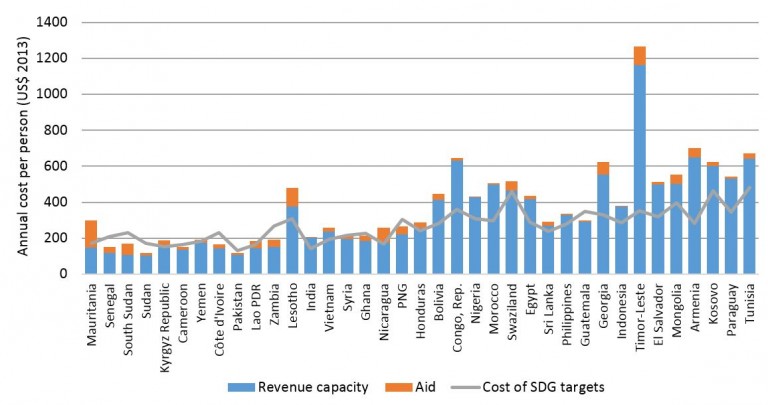
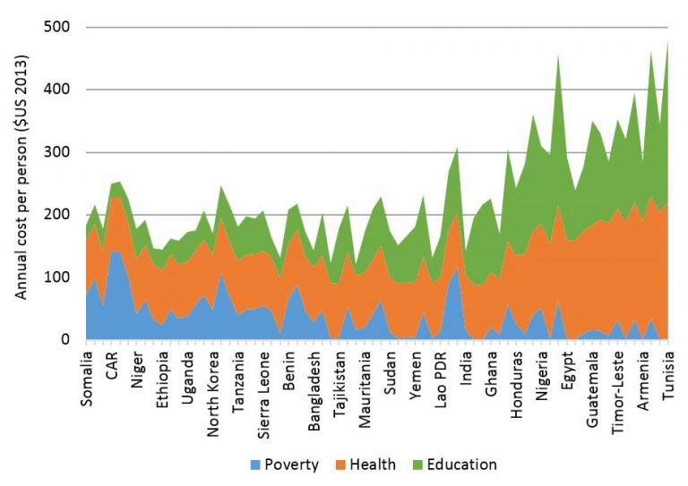
The chart below shows the annual per person costs on a country by country basis for low and lower middle income countries. Unsurprisingly, the cost of ending poverty is highest in poorer countries (blue area). Education and health costs (green and orange areas respectively) tend to rise as countries get richer.

Cost of poverty, health and education SDG targets in LICs and LMICs

Hoy-cost-of-SDGs-figure-1-768x543


Countries ranked by GNI per person (Atlas Method) from left to right. The underlying data for the figures included in this post is available for download here [xlsx].

To place these figures in context, in some countries, such as the Democratic Republic of Congo, the cost of reaching these SDG targets is almost as much as their GDP. This draws into question the affordability of these goals for the poorest countries in the world.

Can developing countries afford them?

To determine the affordability of the targets, the costs outlined above are compared to the amount of public finance (both government revenue and aid) available. In our analysis it is assumed that only public finance will be drawn on, as this is typically the case for providing cash transfers to those in extreme poverty, as well as health and education services to those currently missing out.

To calculate the total level of public finance available for the three SDG targets, potential government revenue is combined with existing levels of aid. Potential government revenue is based on IMF and World Bank calculations of how much extra revenue countries could theoretically raise given their present level of development. Using potential, as opposed to actual, government revenue means that there is an onus on national governments to raise as much revenue as possible.

A key assumption is that only half of potential government revenue and aid would be directed to achieving these three SDG targets. This is based on the fact that public finance is spent on a range of other sectors such as infrastructure and security.

This costing exercise produces three key findings. First, almost all lower middle income countries (LMICs) can meet the costs of these three SDGs. If potential government revenue is attained, aid would not be needed in most LMICs to finance these SDG targets, as can be seen in the chart below.

Public finance available vs cost of key SDG targets: LMICs

Hoy-cost-of-SDGs-figure-2-768x405


Countries ranked by GNI per person (Atlas Method) from left to right

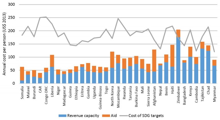
Second, effectively all low income countries (LICs) can’t afford these three SDG targets. Relying on mobilising greater government revenue alongside existing levels of aid to LICs will not be enough. This can be seen in the chart below. Collectively the total financing gap in low income countries is over US$70 billion annually.

Public finance available vs cost of key SDG targets: LICs

Hoy-cost-of-SDGs-figure-3-768x421


Countries ranked by GNI per person (Atlas Method) from left to right

Finally, there is enough ‘surplus’ aid in LMICs to close half the financing gap in countries that can’t afford these SDGs (largely LICs). In other words, if donors redistributed aid from LMICs to LICs, theoretically there would be enough public finance available for most countries to afford these SDG targets.

These findings clearly illustrate that greater efforts are needed to assist low income countries to achieve these key SDG targets by 2030. Given that public finance will carry the burden of the costs for these targets, additional aid will have an important role to play in filling the financing gap. A key recommendation that emerges from the analysis is that donors should commit to providing at least 50 per cent of their aid budgets to least developed countries (LDCs). Currently donors only provide, on average, around 30 per cent of their aid budgets to LDCs. According to the latest OECD data, Australia gave less than a quarter of its aid budget to LDCs, ranking 24th out of 29th among DAC donors on this measure.

This blog originally appeared on the Development Policy Centre, available here: http://devpolicy.org/can-developing-countries-afford-the-sdgs-20160209/

Why we need to rethink how we measure inequality – please welcome the Absolute Palma index

Global Development

The world is abuzz about inequality

  • Pope Francis famously tweeted that inequality is the root of evil.
  • As we witnessed in Davos in January, the media can’t get enough of Oxfam’s statistic that the richest 85, 80, 62 people have the same wealth as the poorest half of the planet.
  • In 2014, a 700-page book on inequality by a French academic was a worldwide best seller.

Credit: Paul Smith, Panos

Credit: Paul Smith, Panos

But what exactly is this inequality everyone is talking about? It turns out that we might be measuring it all wrong. The Gini coefficient and (increasingly) the Palma Index are the most popular tools for measuring inequality within a country. These indicators calculate the ratio of the incomes of the rich over the poor. For instance, the Palma is a score calculated by dividing the share of income of the richest 10% by that of the poorest 40%.

The problem with these approaches is that they only measure relative inequality. If the incomes of the poor grow as fast as those of the rich, these measures will stay the same over time, but the difference in income from a one percent growth for the poor versus a one percent growth for someone already rich can be significant. As the Italian demographer, Livi Bacci, said ‘it is not much of a relief for somebody living on $1 day to see that his income, up by three cents, is growing as much as the income of the richest quintile’.

Unfortunately, relative inequality measures don’t tell us about the absolute gap in incomes between the rich and the poor.  

Exploring the difference between relative versus absolute inequality

To explore the differences between absolute and relative inequality consider the example of the Philippines (see figure).

Over the last 25 years, relative inequality remained fairly stable in the country. This can be seen by the fact that the red line is quite flat across the income distribution as on average all people have experienced a growth rate in their incomes of around 2% a year. However, the green line shows that the additional income generated from this growth is massively weighted towards the rich end of the income distribution – they got the lion’s share of the dollars, a fact obscured if we stick to measures of relative inequality.

In other words, absolute inequality increased dramatically.

Chart 1

[Note: The slower average income growth for the top percentiles is largely due to the very richest people in the Philippines suffering considerable loss in incomes during the 2008 financial crisis.]

Why does this matter?

Politicians, pundits, and other voices often herald the impressive economic growth of developing countries in recent decades as a sign that the end of poverty and extreme inequality is near. And, in many countries relative inequality indicators are suggesting the poor are catching up with the rich.

For instance, using a relative inequality measure the World Bank boldly concluded that an era of shared prosperity is already upon us. According to its Global Monitoring Report, the poorest 40 percent fared better than the average in 58 of 86 countries. Yet, a recent paper shows that while the income of the poor may have grown faster, in a number of these countries they captured a smaller share of new income from growth compared to the richest 10 percent.

Even more shocking, a recent ODI paper shows that in the past 30 years absolute inequality always increased when countries experienced long periods of growth across income groups.

The insights gleaned from comparing relative versus absolute inequality tell us that growth needs to be even more intensively pro-poor than often suggested. In fact, closing the gap between the rich and poor requires the bottom 40 percent to grow around twice the country average.

A new measure of the gap between the rich and poor

Measuring how the gap between the rich and poor changes over time is an essential first step in addressing inequality. The ODI paper proposes a new measure called the ‘Absolute’ Palma, which is the average income of the top 10 percent minus the average of the bottom 40 percent.

This is a modification of the Palma ratio that was first proposed on this blog. As mentioned above, the Palma is a relative measure, calculating the ratio of the share of income of the top 10% to that of the bottom 40%. In contrast, the ‘Absolute Palma’ captures what this means in terms of the actual income gap between the top 10% and bottom 40%.

People scoffed at the initial proposal for the Palma ratio, (which was a big improvement on the Gini), but it has caught on rapidly. We think an Absolute Palma would be an even better measure of inequality – let’s hope it catches on just as quickly.

This blog originally appeared on Duncan Green’s blog, available here: http://oxfamblogs.org/fp2p/why-we-need-to-rethink-how-we-measure-inequality-please-welcome-the-absolute-palma-index/

Three challenges for the World Bank’s Commission on Global Poverty

Global Development

The World Bank’s Commission on Global Poverty will release a report this year about measuring progress towards reducing poverty and promoting inclusive growth that is likely to shape the next 15 years of the international development agenda on this aspect of the SDGs. This blog highlights three challenges for the Commission as they think through solutions; to avoid creating perverse incentives, to ensure that countries starting points are taken into account and to combine poverty and inclusive growth in a constructive way.

I’m going to illustrate these by drawing on an ODI paper launched today that projects what levels of national poverty (that is, poverty defined by national poverty lines) might look like in 2030. While there have been numerous projections of extreme poverty to 2030, this paper is the first time the same exercise has been done with national poverty. Specifically, the paper looks at the feasibility ofSustainable Development Goal (SDG) target 1.2 to halve national poverty. It shows that the vast majority of developing countries could achieve this target if high growth prevails for the bottom 40% of their population (and national poverty lines don’t change).

The challenges for the Commission are discussed one by one below:

Avoid Creating Perverse incentives

The way targets to reduce poverty are measured can create perverse political incentives as unlike most indicators in international development, poverty lines are set and updated by the institutions that are aiming to reduce poverty. This is particularly the case for national poverty as there’s little incentive for governments to raise the level of national poverty lines (ie the level of their ambition) if they’re also trying to meet targets to reduce national poverty. If they did so, of course, the government would be increasing the number of people who live in poverty making it harder to reach poverty reduction targets.

For example, Indonesia is on track to virtually eliminate national poverty by 2030. Currently only around 10% of Indonesians live below the national poverty line of around $1.10 (2005 PPP), which is one of the lowest in the world. If the national poverty line was consistent with other countries of a similar average income, it would be almost three times higher and two-thirds of the population would live below the national poverty line. As it stands, there is little incentive for the Indonesian government (or that of any other country) to ensure poverty lines truly reflect national realities.

Countries should be encouraged to dramatically reduce poverty, however how their progress towards this is measured should not create preserve incentives that allow governments to claim to have made rapid progress even if there has been little change in the standard of living of the poor.

Ensure countries starting points are taken into account

Efforts need to be made to ensure countries’ starting points are taken into account when comparing progress in reducing poverty across countries. This is because the current level and depth of poverty in a country is a key factor in determining how likely it is to be able to meet any target to reduce poverty.

For example, countries are on a very uneven playing field trying to achieve SDG target 1.2 to halve national poverty by 2030. In some countries, over 60% of the population lives below the national poverty line, while in others that figure is less than 10%. This can be seen in the chart below of current levels of national poverty in 59 developing countries that had recent and reliable data available.

How far people live below the national poverty line – the poverty gap – also matters. The target to halve national poverty is significantly more challenging for countries in Latin America and Sub-Saharan Africa where the average poverty gap is around 20% compared to less than 5% in East and South Asia. This means the incomes of the poor need to increase much more in countries in Latin America and Africa compared to in Asia to meet the target. Therefore the target only requires some countries to take relatively small steps while others need to jump substantially higher to meet the same target.

Combine poverty and inclusive growth agendas by prioritising high growth for the bottom 40% of the population

Focusing solely on promoting high growth for the bottom 40% of the population is one of the most efficient ways to reduce income poverty and promote inclusive growth. Unfortunately the World Bank and SDG inclusive growth targets do not directly aim for this. They are measured by comparing the average growth rate in a country with the growth rate of the bottom 40%. However if both the average and bottom 40% growth rate in a country are low then achieving inclusive growth targets could have little impact on reducing poverty.

The projections of national poverty to 2030 in the ODI paper clearly illustrate the need to prioritise high growth for the bottom 40%. Twice as many countries would be on track to halve national poverty by 2030 if the bottom 40% grows 2 percentage points faster than the average compared to equal growth across the distribution, keeping the overall level of growth constant. In other words, for the same rate of average growth, huge progress can be made in reducing poverty if the bottom 40% are the main beneficiaries. This can see in the case of India: equal growth across the distribution would leave 18% of its population in national poverty in 2030, whereas if the bottom 40% grow 2 percentage points faster than the average, this could virtually eliminate national poverty.

These challenges need to be addressed for the ambition of the SDGs – and the World Bank’s – goals to be realised. Otherwise progress reducing poverty and promoting inclusive growth could be said to be achieved even if there is actually little change in living standards for the poor.

This blog originally appeared on the ODI website, available here: http://deliver2030.org/?p=6842

The definition of extreme poverty has changed – here’s what you need to know

Global Development

The World Bank has just announced a new definition of ‘extreme poverty’. This couldn’t be more timely: world leaders have just committed to eliminating extreme poverty as part of the Sustainable Development Goals (SDGs) (here’s ODI’s take on it), the World Bank has already made ending extreme poverty a strategic goal, and NGOs are campaigning to reach Zero Extreme Poverty by 2030.

But what does this new definition imply exactly?

How does the level of extreme poverty change under this new definition?

The World Bank estimates that less than 10% of the world’s population live under its new threshold of $1.90 a day (based on the US dollar exchange rate of 2011).

This is a dramatic fall from the more than 1 billion people in extreme poverty in 2011, under the old definition of living below $1.25 (measured in 2005 US dollars).

Why did they change the definition?

The previous definition of $1.25 a day relied on information about prices that was 10 years old. The recent announcement updates the extreme poverty definition to take into account the latest estimates of how prices of goods and services vary across countries, based on 2011 dollars.

Calculating the number of people in extreme poverty across countries relies on information about prices because the more expensive goods and services become, the less people can buy with a set amount of money. Measuring differences in prices across countries is known as purchasing power parity (PPP) and has been popularised by the Economist through the Big Mac Index, which compares the average price of a Big Mac around the world.

While measuring the price of a Big Mac is relatively easy because it is the same product from the same restaurant chain, comparing a standard consumption basket across countries is fraught with challenges. Experts embark on this challenge every 5-10 years – most recently in 2011 – and estimate changes in PPP between countries.

How does this impact our efforts to end extreme poverty?

The new definition heralds a significant departure from how the World Bank updated its extreme poverty line in the past. Up until the announcement, the extreme poverty line was created by averaging the national poverty lines of the poorest countries in the world. The original $1 a day measure (using 1985 PPP) was based upon an average of the 8 poorest countries in the world that had data available, while the $1.25 a day line was based on the average of the poorest 15 countries.

The problem with this approach is that extreme poverty will never end using this definition. For as long as the poorest countries in the world set a national poverty line that identifies some of their population as poor then there will always be people in extreme poverty.

The World Bank has attempted to overcome this challenge through the new definition by simply increasing the $1.25 (2005 PPP) poverty line to $1.90 (2011 PPP), to reflect a rise in the price of goods around the world. However, this approach no longer factors in how national poverty lines have changed over time. It implicitly assumes that the $1.25 (2005 PPP) line is the most appropriate extreme poverty line and it only needs to be updated to reflect those changes in price levels – as opposed to underlying changes in how the poorest countries in the world define poverty.

From the Bank’s perspective, the new definition is an understandable compromise, given the incompatibility of the goal to end extreme poverty and the World Bank’s existing approach in calculating the extreme poverty line, which effectively made the goal unreachable.

From a broader perspective this shift will raise questions and alarm bells, as the new definition may lead to tens of millions of people falling into or being lifted out of extreme poverty overnight, at a stroke.

This blog originally appeared on the ODI website, available here: https://www.odi.org/comment/9934-extreme-poverty-definition-world-bank-sustainable-development-goals

What has Christmas shopping got to do with allocating foreign aid?

Global Development

At Christmas time, the furthest thing from your mind when you are shuffling around crowded shops is what all of this has to do with the allocation of foreign aid. But you may be surprised to find that there are several things Christmas shopping can teach us about the way in which such aid is allocated.

Obviously, aid is an important issue that should be taken seriously. Nonetheless, ’tis the season to be jolly, so this blog takes a light-hearted look at aid allocation, drawing out four key lessons.

1. You have to know something about who you are buying for

Buying a present for someone you know nothing about, who may live a long way away, is a big mistake. You rarely hit the mark and will almost certainly disappoint.

The same is true of aid. If donors have little understanding of country context, we should not be surprised that the results are disappointing. At a minimum, donors need in-depth knowledge of the countries in which their aid is being spent and have some staff based in that country (or who at least make regular visits).

2. Meeting expectations matters

Avoiding the embarrassment of dramatically underspending or overspending on your loved ones is a must. It’s a relief when you meet their expectations, but getting this right can be tricky – particularly in the early stages of a romantic relationship. It can be really awkward if he buys her expensive jewellery and she buys him cheap socks.

In the aid world, meeting expectations is crucial to ensure the best possible outcomes for the beneficiaries of aid programmes. Few things are more disruptive than unreliable or inadequate funding. Yet the aid industry is plagued with this problem. For example, the Australian government has just announced the seventh cut in funding to its aid budget in just over two and a half years, which will lead to the early end or downsizing of many programmes.

3. You shouldn’t buy anything people don’t need or want

If you buy people things they don’t need or want, you are wasting your time and resources. We see how common this is after Christmas, when there are long queues of people at the returns counters trying to exchange their unwanted presents.

The same can – and sometimes does – happen in the aid and development industry. Often well-meaning initiatives spend large sums of money on things no one actually needs or wants. A classic example has been an initiative to provide t-shirts for Africa. There is little evidence to suggest that there is a massive unmet demand for t-shirts in Africa or that t-shirts actually benefit people a great deal. In response to such initiatives, ‘local ownership’ has become something of a mantra in the aid industry in recent years, whereby the beneficiaries of aid programmes actually have a say in where and how aid is spent – a welcome shift.

4. Don’t buy someone something they would have bought for themselves.

When was the last time someone bought you a loaf of bread as a Christmas present? Probably never. Why not? Because you try not to buy something that they will definitely buy for themselves. The best present is something they need, but would have been unlikely to buy for themselves.

Donors face a similar but more complicated reality. They should avoid spending aid on things that the governments of developing countries would definitely spend money on themselves, such as politicians’ wages. Not only will this have little or no impact on most of the aims of aid (such as poverty reduction); we can be sure that the recipient government would have certainly spent money on this.

Smart aid allocation focuses on areas that are crucial for lasting development but that may not be top priority for recipient country governments or the private sector, such as the provision of basic education and healthcare to those who would otherwise be left behind.

I hope these four lessons come in handy if you too are finishing your shopping in the coming days. And my biggest hope is that the aid industry keeps these lessons in mind!

This blog originally appeared on the ODI website, available here: https://www.odi.org/comment/9108-christmas-shopping-foreign-aid-allocation-development

Five myths about poverty, growth and inequality

Global Development

‘Pro-poor’ or ‘inclusive’ growth ensuring that growth benefits the poor  more than the average  –  is a popular mechanism for reducing extreme. For example, the Sustainable Development Goals and the World Bank both have targets that aim to promote income growth for the bottom 40% of every country’s population.

While we should welcome this recognition that who benefits from growth matters just as much as the amount of growth, some myths around this remain.

Myth 1: in poor countries, GDP growth translates into improvements in household living standards.

This myth is based on the idea that if developing countries focus on lifting GDP growth, this will raise average household living standards.

But forthcoming ODI research illustrates that for the poorest countries, there is not a clear relationship between GDP growth and average household levels of consumption. This can been seen in the chart below of countries that had low income status around 2000.

It’s not clear whether this is due to a disconnect between the formal economy and household living standards, or problems with how we measure these.

Myth 2: countries that gained middle-income status over the last decade have higher levels of inequality.

This common belief is based on the Kuznets Curve, which suggested that as countries move from low to medium standards of living, inequality worsens. Recent UN publications reinforce this idea by providing evidence for it on average.

However, forthcoming ODI research illustrates that this average is driven entirely by a few outliers, as seen in the chart below of countries that had low-income status around 2000.

In fact, if you exclude the four outlier countries on the far right of the chart (Honduras, Zambia, Lesotho and Central African Republic) then the opposite is true. Countries that moved from low to middle income status are slightly more equal on average than those that stayed low income.

Myth 3: growth benefits the poor just as much as everyone else.

This myth was spread by a misinterpretation of a famous World Bank paper by Dollar and Kraay, Growth is Good for the Poor, which shows that on average the bottom end of the distribution has grown roughly as fast as the mean. This led some to argue that the poor always benefited from growth as much as everyone else in all countries.

But an ODI paper shows that while around half of countries experienced ‘pro-poor’ growth, 80% of the world population lived in countries where the income of the bottom 40% grew slower than the average.

If all countries had experienced equal growth over the last three decades, 200 million more people would have escaped extreme poverty by 2010. As this chart shows, these 200 million people are in middle-income countries.

Myth 4: pro-poor growth will reduce the income gap between rich and poor.

A common misunderstanding is that if growth was higher for the poorer parts of the distribution, this would reduce the income gap between rich and poor.

In fact, as a new ODI paper illustrates, the gap in incomes between rich and poor has increased in all countries that experienced positive growth over the last three decades.

This chart shows how the gap between the average income of the top 10% and bottom 40% grew each year.

Myth 5: we should focus on ending extreme poverty before addressing climate change.

Some commentators suggest that developing countries should focus on boosting growth to eliminate extreme poverty by 2030, and only then worry about reducing carbon emissions. This implies that it’s possible to delay addressing climate change and that its devastating effects will not push people back into extreme poverty.

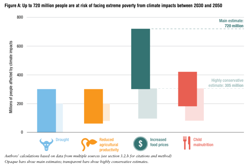
But an ODI report highlights that if action is not taken to address climate change immediately, over 700 million people could re-enter extreme poverty from 2030 to 2050.

So where does this leave us?

As our research shows, pro-poor growth can help eliminate extreme poverty. But this approach alone won’t close the gap between the rich and the poor – and we can’t try and address it without addressing climate change simultaneously.

This blog originally appeared on the ODI website, available here: https://www.odi.org/comment/9996-economic-growth-pro-poor-poverty-absolute-inequality

Combating Climate Change is necessary to End Extreme Poverty

Global Development

This weekend hundreds of thousands of people marched in cities across the world to show world leaders that serious action needs to be taken to combat climate change. This is required not only to preserve the environment, but also because of the impact of climate change on the most poor and marginalised people. A recent ODI report shows that over 700 million people are set to re-enter extreme poverty between 2030 and 2050 if business as usual continues. The figure below shows this will be caused due to drought, reduced agricultural productivity, increased food prices and malnutrition.

Zero Poverty and Zero Emissions

The report also shows that many of the actions required to combat climate change are actually ‘growth enhancing’. In other words, they are likely to boost GDP growth. For example, increasing energy efficiency is set to not only help combat climate change, but also reduce losses to the economy.

200million People are left in Extreme Poverty due to Unequal Growth

Global Development

Worsening inequality is a key challenge of our time. Evidence from Oxfam illustrates that next year, if current trends continue, the richest 1% of humanity will own half of global wealth. Our own computations show that over the MDG period (1990-2015), nearly 4 people in 5 lived in countries where the bottom 40% of the income distribution grew more slowly than the average.

We should be concerned about inequality for many reasons – just one of them is that it is intimately linked to levels of absolute deprivation. Growth can reduce poverty even if offset by rising inequality but it makes the challenge much harder. In light of the global call of the SDGs to ‘leave no one behind’ and the proposed target that the incomes of the bottom 40% within countries should exceed national averages, it becomes pertinent to think about what the poverty reducing effect might be.

One potential approach, featured in a recent World Bank working paper, is to undertake poverty projections over the next 15 years under different inequality scenarios. Another, which we adopt, is to estimate how many people would be poor today according to the $1.25 a day benchmark if countries had experienced more equal growth over the last 30 years.

Using some simplifying assumptions, we explore two scenarios. Under the first, ‘equal growth’, we assume the bottom 40% of the population grew at the same rate as the average of their country. Under another, ‘pro-poor growth’, we assume the bottom 40% grew faster than the average (we considered gaps of 1 to 3 percentage points, in line with the actual experiences of some countries in the past 3 decades). We wanted to keep overall growth constant so that we isolated the impact of inequality – this meant that any increase to the growth of incomes of the bottom 40% had to be subtracted from the incomes of richer people within that country. We considered two possibilities – if this income was subtracted equally from every person in the top 60% of the society, and if it came solely from those fortunate enough to be in the top 10%.

The headline finding: many fewer people could have been left behind in extreme poverty had growth been more equal over the last 30 years.

We first illustrate this claim, then highlight an important caveat.

  • Equal Growth Scenario

If all people within each country had experienced equal income growth, around 200 million more people – about 1 in 5 of those that are currently very poor – would have escaped extreme poverty. Interestingly, the difference is entirely due to unequal growth in many of today’s middle income countries (Chart 1). On average, today’s low income countries experienced relatively equal growth between the bottom 40% and the average.

Total Poverty by Income Category

Under this scenario, China could have effectively eliminated extreme poverty along with countries including Mexico and Peru. In other words, while growth played a key role in reducing extreme poverty in fast growing middle income countries like China, if growth had been equal, the impact on poverty could have been much bigger.

  • Pro-poor growth

Fewer than half as many people would live in extreme poverty today if the incomes of the bottom 40% of people in each country had grown two percentage points faster than the average. For example, extreme poverty could have been eliminated in Indonesia and Philippines and could have fallen to around 5% in India and Vietnam. This level of pro-poor growth is possible as it actually did occur in around a quarter of countries.

Now the key caveat… Initial poverty levels and the type of redistribution matter

In too many countries still, poverty rates over 40% are part of recent history or current reality. In these places, redistributing income bluntly from the top 60% of the population can actually increase poverty levels if it pushes people that were above the poverty line below it. One alternative is that these high-poverty countries redistribute income growth from the top 10% of their population alone – this is likely to reduce poverty in most but not all the countries we examined.

Whether growth is redistributed from the top 60% or the top 10% also has a potentially big impact on the global poverty (Chart 2). If growth is redistributed away from top 60%, then extreme poverty starts to increase when growth is more than 2 percentage points higher for the bottom 40% relative to the average. In contrast, if growth is redistributed away from top 10%, the global poverty rate continues to decline.

Extreme Poverty under different scenarios

So what can we learn from past experience?

This analysis illustrates that significantly more poverty reduction could have occurred if the income growth of the bottom 40% of the population was higher than the average in many MICs. In contrast, in most LICs this would have done very little to eliminate extreme poverty. To move towards the SDG poverty goal – to ‘end poverty in all its forms everywhere’ – growth needs to be more equally distributed in middle income countries. While in LICs, growth needs to be higher while continuing to be relatively equal across the distribution. But we also show that governments need to be very careful in how they redistribute in order to avoid perverse outcomes. ‘Leaving no one behind’ will require a careful mix of global ambition and careful attention to country realities.


This post originally featured on the Post-2015 Blog, available here: http://post2015.org/2015/07/30/how-many-people-were-left-behind-by-unequal-growth-during-the-mdg-period/

The Retreat of Australia’s Aid Program

Australian Aid Policy

Key Points

  • In 2015-16, Australia’s Aid Program will be around A$4 billion, which is less than half the size of what it would have been if the bipartisan promise to reach 0.5% of GNI in 2015 was kept.
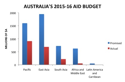
  • The cuts to the aid program over the last three years have disproportionally affected the world’s poorest countries, with aid to Sub-Saharan Africa to fall to less than 10% of the level it was promised to be.
  • Only the Pacific and countries that Australia has a refugee processing deal with have been spared the bulk of the cuts, as aid to the Pacific is still set to be almost 60% of the level originally promised. 

Background

Three years ago the Australian Government released a blueprint for the bilateral aid program in 2015-16 disaggregated by region. The plan was for a geographically diverse aid program that had a presence in the world’s poorest countries, while still clearly prioritising Australia’s immediate neighbourhood. However these spending promises have failed to be fulfilled. Instead, Australia’s aid program almost exclusively focuses on the Pacific and some nearby countries in East Asia. The chart below shows that Africa and the Middle East as well as Latin America and the Caribbean have disproportionally suffered from the aid cuts since 2012.

Australian 2015-16 Aid Budget

Potentially one of the most concerning aspects of the retreat of Australia’s Aid Program from its trajectory three years ago is the shift away from the world’s poorest countries. As discussed in this blog, Australia’s aid program was already dramatically disproportionally skewed away from the world’s poor. The latest round of aid cuts is set to exaggerate this imbalance even further.

Source:

DFAT 2015 <http://dfat.gov.au/aid/Pages/australias-aid-program.aspx>